hydro
healing
A Notting Hill, luxury spa, start-up: came to me&him with an idea, a premises and a brief to disrupt the market place. We created hydro healing.
Collaborating with Work Design’s Elise Valmorbida, we created a visual and verbal brand identity for all touch points; on and offline, in and literally outside the spa.
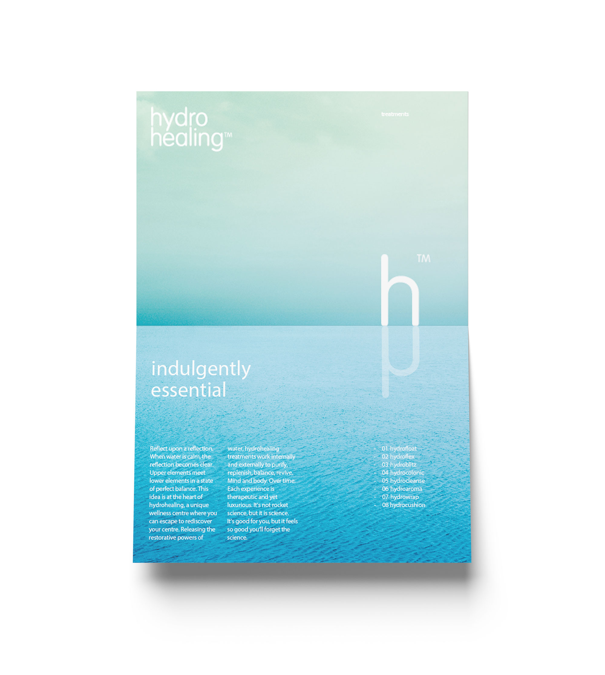
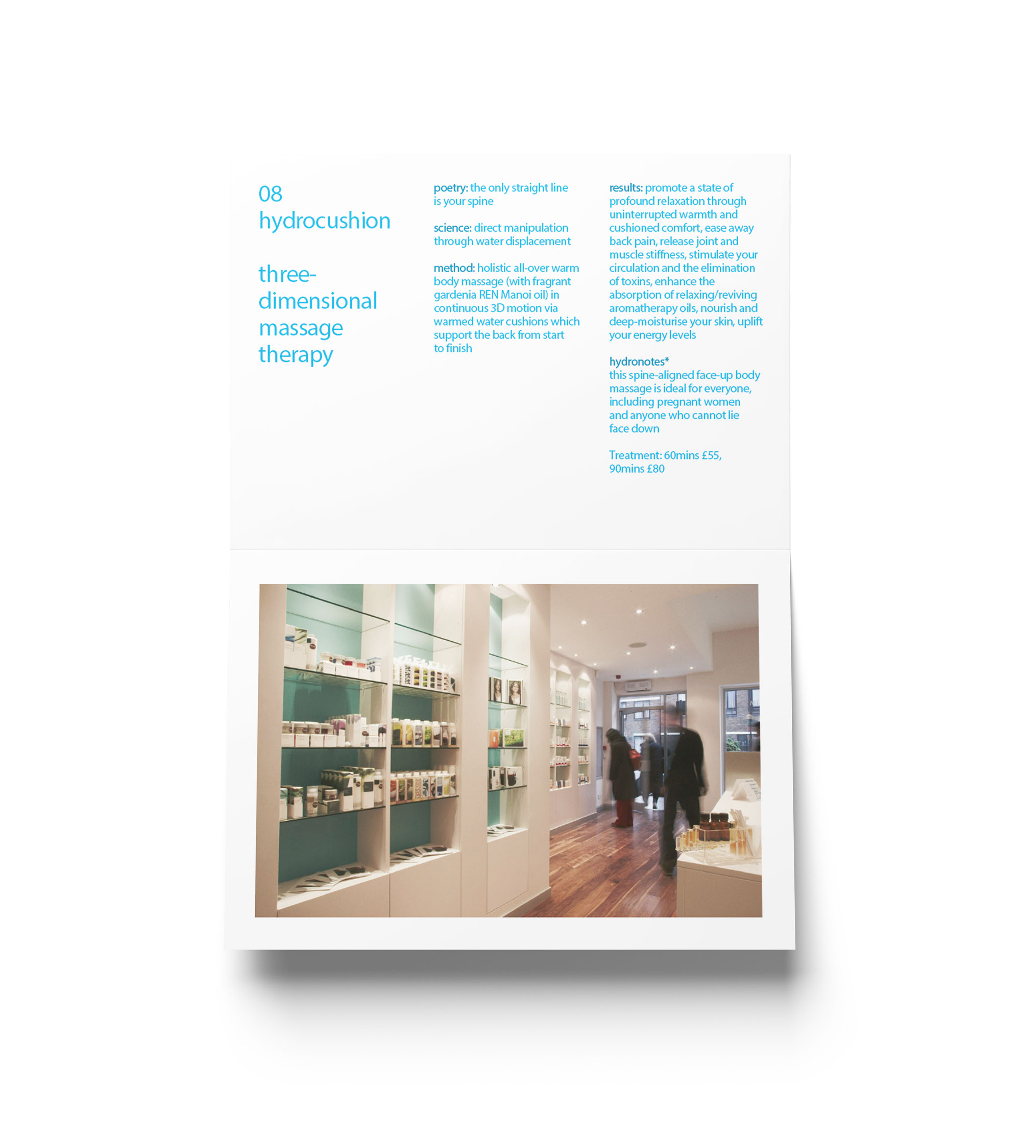
Building on the philosophy of ‘wellness through water’ is hydro healing – a new concept in healthcare and the UK’s first urban spa to focus solely on harnessing the healing properties of our most abundant natural element.
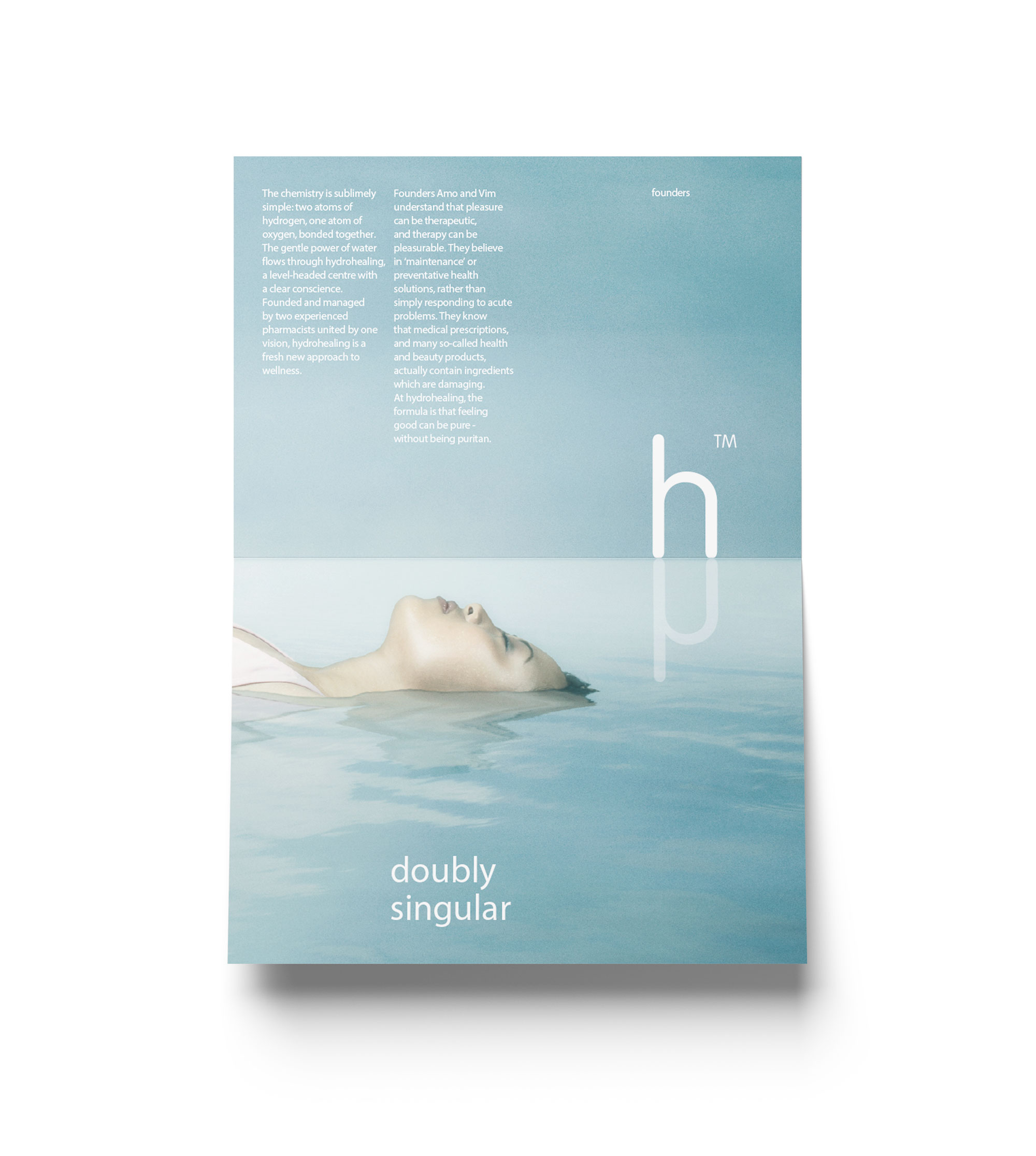
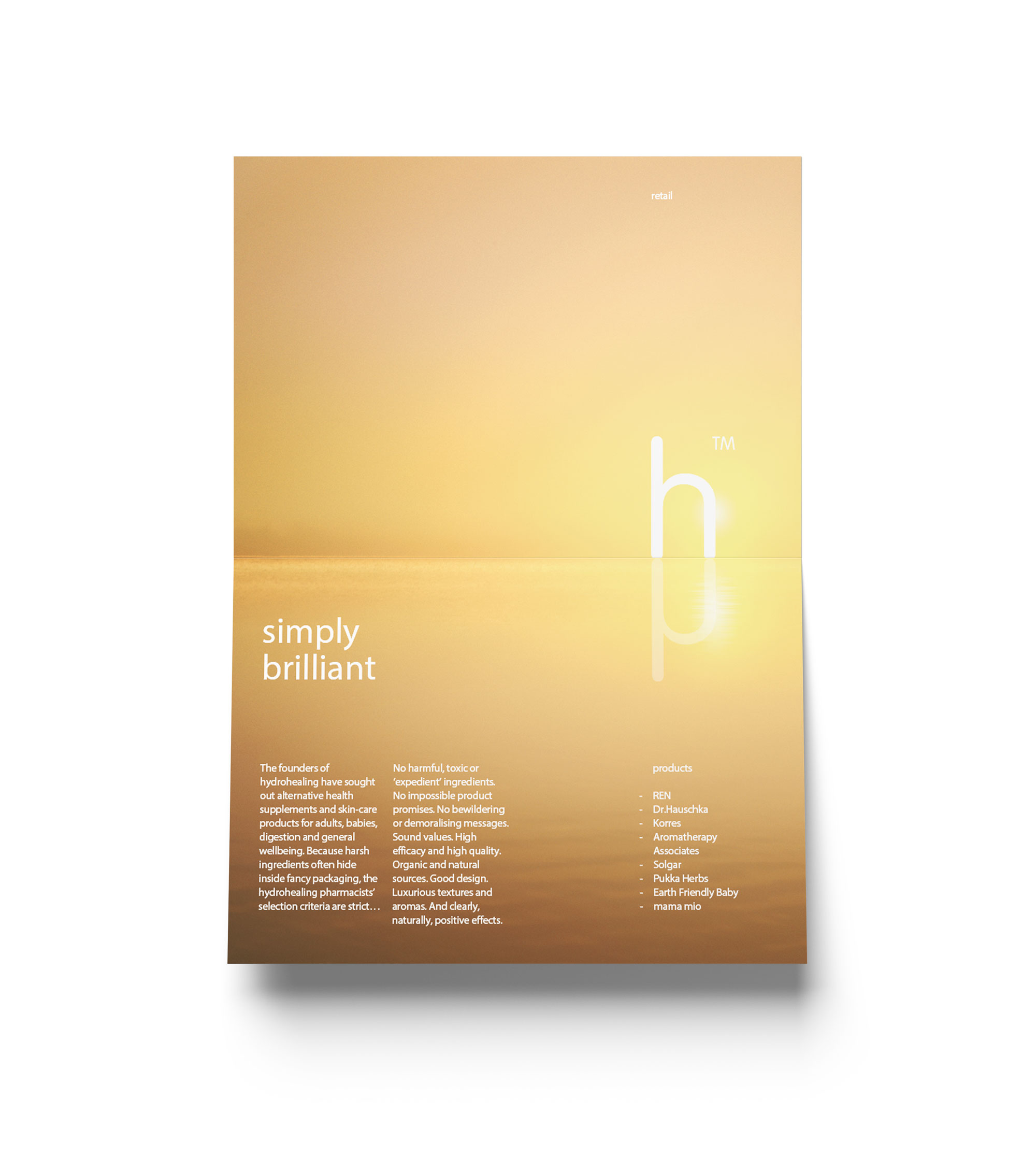
Transparency and reflection are used to create graphics and imitate water. A single, rounded h reflected creates the unique double ‘h’ logo. The identity’s look and feel extends to the new website, treatment brochures and signing. Their business cards and opening announcement flyers saw me&him use bio-degradable transparent plastic.


“There are designers and then there are designers like me&him who take creativity to the next level. The guys were not only given a very simple brief but had very little input from ourselves. The result as you can see is fantastic! They have produced a concept, design and brand image that has far exceeded our expectations.”
—A.M.Khan, Director
“We didn’t want to mimic all those spas that make incredible promises about wellbeing while promoting ‘healthcare’ products that actually do harm. As pharmacists, it was important that our new brand had scientific credibility underpinning the luxury of treatments and retail offer. We have medical therapy at one end of the scale, sensual indulgence at the other. You created a unique language for us. Great work. Very different. Our words will not do justice to your skills.”
—Vim Patel, Director